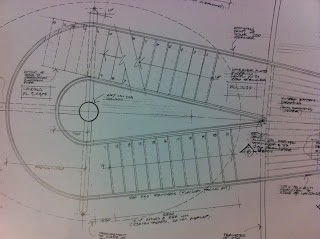
The books 'Plan and section Drawing' by Thomas C. Wang and 'Details in Architecture' Volume 3 have been very useful in understanding the functional drawings of buildings and cities. The functional essence of many defining aspects of a city was made very clear from the primary research collected previously, so it may be a fruitful research thread to follow.
These images are from 'Details in Architecture' the functional purpose of them stand out in the harsh sharp lines and construction lines. However, if translated directly into typographic designs I don't think they would communicate the idea of a city or even the idea of an environment shaping someone. Although it looks functional these style of drawings aren't widely familiar, therefore the communication of concept would be compromised.
Stylistically these plan drawings are very similar to the architectural sketches above but there is much more texture used to differentiate between surfaces. The functionality that seems to turn up not only in these drawings but also in the very definition of an urban environment that can be seen in the primary research done earlier in this brief. This theme could be brought into the final product of this project by selecting a particularly functional typeface to manipulate, made up of legible and possibly angular shapes.
The way the roofs are given depth through the use of cross hatching and line spacing could also be used, shaping the letters from tightly packed houses as seen from above. This draws on the idea of Mo's urban origins shaping who he is not only in the sense of his physical surroundings at the time but also the way that people are packed together in cities therefore social interaction acts as a personality shaping force as well.
The section drawings in the same book draws attention to the layers created by cityscapes when viewed from the side. This could be utilised in the final type face by creating a body copy font that when placed together cut off and obscure one another in the way that rows of houses and buildings do in the city. Also above can be seen two photographs I have taken from this perspective. I intend to experiment with creating landscapes of text where the ascenders of the letters below obscure letters above. This would of course need to be done very carefully so the text was still completely functional and legible.
The natural progression from plan view sketches seemed to be maps, a simplified and more functional version of the same thing. The old map above was chosen in place of many modern maps because it shoes the clear placement of buildings. A strong sense of spacial awareness and limited space is apparent from this image, inspiring research and experimentation with kerning and line spacing. To accurately convey this spacial awareness the way letters react to the presence of one another when part of a word must be examined. Coincidentally these ideas also fit perfectly with the main personality trait of Mo; his social interaction and reaction to those around him.
When analysed Mo's handwriting also shows a clear spacial awareness. For example, on the upper case sample at the top of the image the letter forms are tall and stretched so that the total length of the word is relatively short, allowing room for more. In the lower case sample the joined letters appear to come in threes as if they have been put into small friend or social groups.


No comments:
Post a Comment