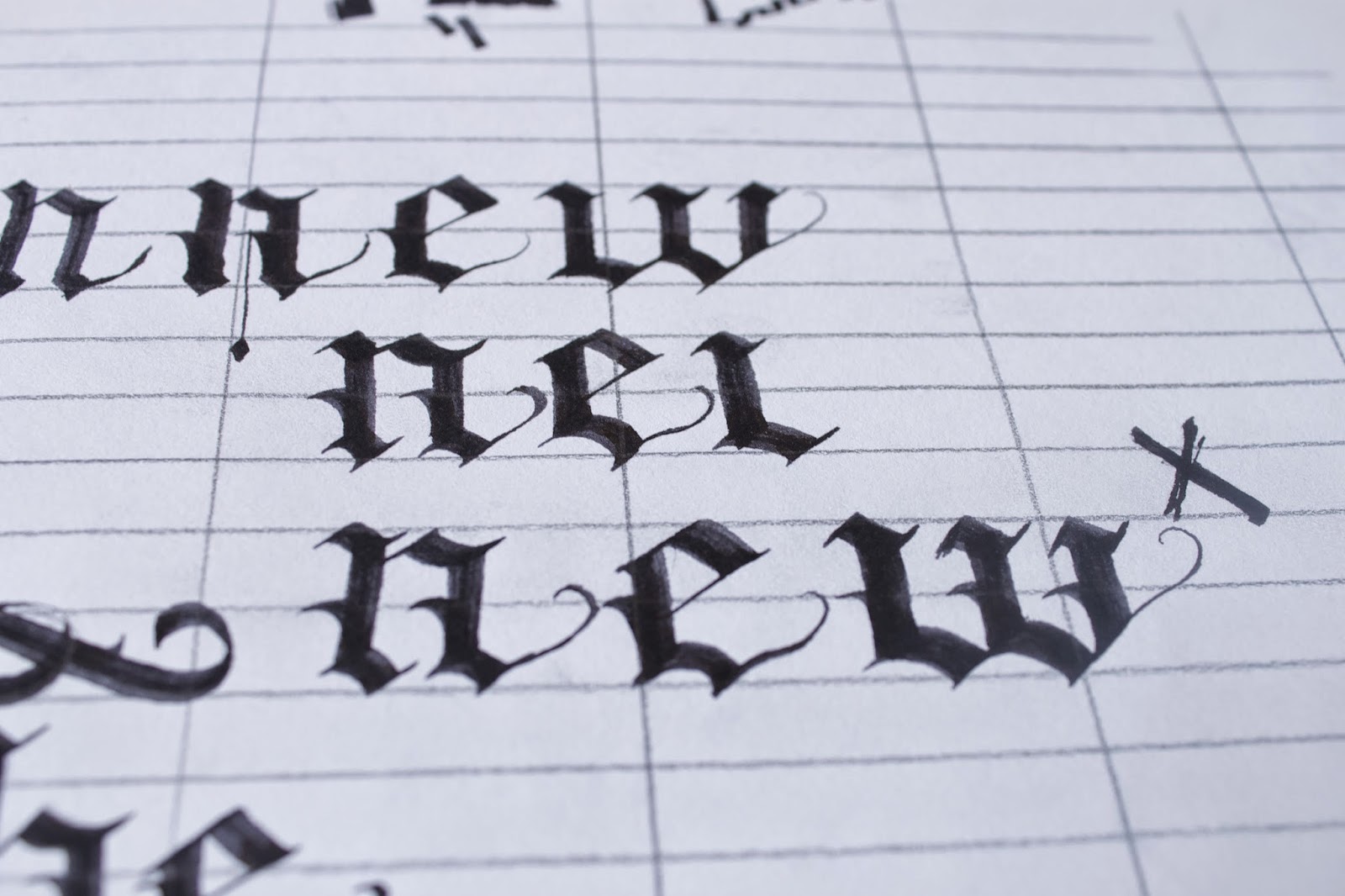
Although I had already created a pinterest board for this project, I went back to it several times to construct an effective blackletter design.
I started out with some of the letterers that I had developed in the last session and looked at the way the words could be best arranged for legibility and how they might interlock to increase the harmony and balance on the page.
However, I had real trouble with the capital N because of the difference in the type of stroke compared to the other letters.
So I went back to the pinterest board and the 'guide to calligraphy to come up with something heavier and that commands more presence on the page.
This resulted in more of a mexican blacklister that was almost a charature the calligraphic style. This is exactly what I need as a starting point for experimentation and development into something different.
I wrangled with some of the scaling and how the few capitals would sit. It turns out the the sharp flat edges of the letters lent themselves beautifully to interlocking. However, I will have to be careful about the space between letters to ensure legibility because interlocking can trick the eye into reading the letters as pattern and not in order.
I struggled a bit with the spacing but after reading up on the style in the 'guide to' I found it was traditional to use the relevant nib width as a guide and this helped a lot.
Getting the small filler words to sit right in the sentence was also tricky and took a few tries. otherwise they either fell into the background and did not read or were somehow the first thing the eye focused on.
To help shape the layout of the design I looked back to my calligraphy pinterest board and found a tradition of interlocking.
Interlocking seemed to be the answer here and I think the result so far really works and feels balanced and reads well.
Adding barbs at level intervals on the stems of the letters also provided a great sense of direction to possible slightly illegible letters allowing the eye to flow across the word and making them quite readable.
Now that I have the frame work I want to look into ornamentation and framing of the letters to see if it will provide a clear development direction. I have started this as can be seen below but Have not as yet found a way that allows the letters to come to the foreground. I will continue trying though.


No comments:
Post a Comment