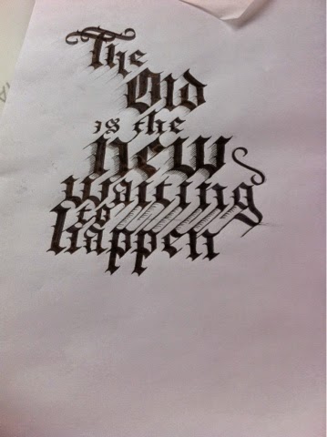
I created A large grid which helped on this count but proved very long in the making and once finished looked much like an isometric grid. The natural connecting lines that this exercise showed me gave me ideas for experimentation in going slightly beyond the tradition of this calligraphy form. The design above is what I am going to use as my base for further experimentation. i need the traditional base to work from so that I can break thr rules in the right way.
I used these lines to play with the sense of three dimensions that they naturally suggest All across this sample I looked at different ways to do this and in so doing I realised it might be a good idea to apply more daring ornamentation lower down on the design to show the development from the original in the design it's self.
Something that had stood out at me from the first was the way blacklister is so overtly comprised of separate and deliberate strokes. So, a natural direction of development seemed to be increasing this appearance for experimental reasons by allowing gaps between the stokes. This did not come naturally to the pen and was very difficult in parts.
Although the appearance was interestingly sharp and suggested further experimentation with a stencil like finish which was not something I foresaw but is very interesting and definitely puts weight behind the idea of old styles providing new impetus. The difficulty with which this finish was achieves also gave me another idea which was to get a bit messy with my experimentation and not to try for anything too neat.


No comments:
Post a Comment