Because in my feedback for the last crit someone mentioned the botanical look and theme of my layouts and subject matter I thought it might be a good idea to collect some images of botanical books to understand what creates their distinct aesthetic and layout.

http://www.lib.udel.edu/ud/spec/exhibits/hort/women.htm
There is a definite theme of block serif text with wide and definite margins. this could be used in my layouts making use of angled grids but with wide margins and dense body copy.

http://makingamark.squidoo.com/history-botanicalart
The space around the illustrations seem to be really important to the structure of the page, this is something that I need to bear in mind when creating my layouts. The calligraphic type at the bottom of each illustration is something that I would like to experiment with further possibly looking into the latin names of some of the insects in the drawings.

One of the distinct problems with my first designs was the alternation between too many different sizes of font. this could be solved by Limiting any alterations in font to lower case one size and upper cad another for titles as shown above.
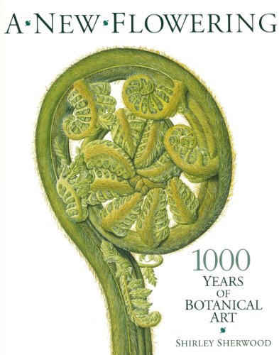
http://www.barnesandnoble.com/sample/read/9781426205095


There is such detail in the illustrations used so I think I will do a new set of drawings to a larger scale so that they will be shrunk when photographed and appears much more detailed.

It's strange that this type writer style of font should come up because someone mentioned just this in the crit feedback. This has got me thinking about the possibility of printing to get a really good sense of a physical interaction created by the imprint of the type on thick paper. this sense of the physical is important to the effect I want to create with these layouts because it is the physical existence of insects that I will be focussing on and they are earthy and strongly grounded in the physical as a topic anyway.
 http://museumvictoria.com.au/collections/items/1096684/display-destructive-insect-red-scale-of-citrus-victoria-circa-1970
http://thepassingtramp.blogspot.co.uk/2012/01/had-i-but-known-authors-2-margaret-n.html
The way that the type is fitted around the rest of the type and image of the page is something I love and think that could work for the titles on some of the pages shaping them around the images in some way.
No comments:
Post a Comment